If surveys.csv, species.csv, and plots.csv are not available in your workspace download them:
Write a function that:
- Takes four arguments - 1) a data frame (where each row is one individual and there is a
genus and a species column); 2) a time argument that provides the column to use for plotting time (e.g., year); 3) a genus_name argument for choosing which genus to plot; and 4) a species_name argument for choosing which species to plot.
- Makes a plot using
ggplot2 with the time on the x-axis, the count of the number of individuals (i.e., the number of rows) on the y-axis, and only plotting data for the species indicated by the genus_name and species_name arguments. The plot should display the data as blue points (with size = 2) connected by blue lines (with linewidth = 1). Make y-axis label Number of Individuals.
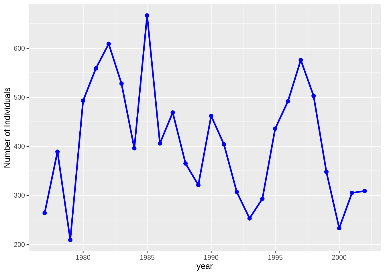
- Use your function, and the data in
surveys.csv and species.csv, to plot the time-series for time = year, genus_name = "Dipodomys" and species_name = "merriami"
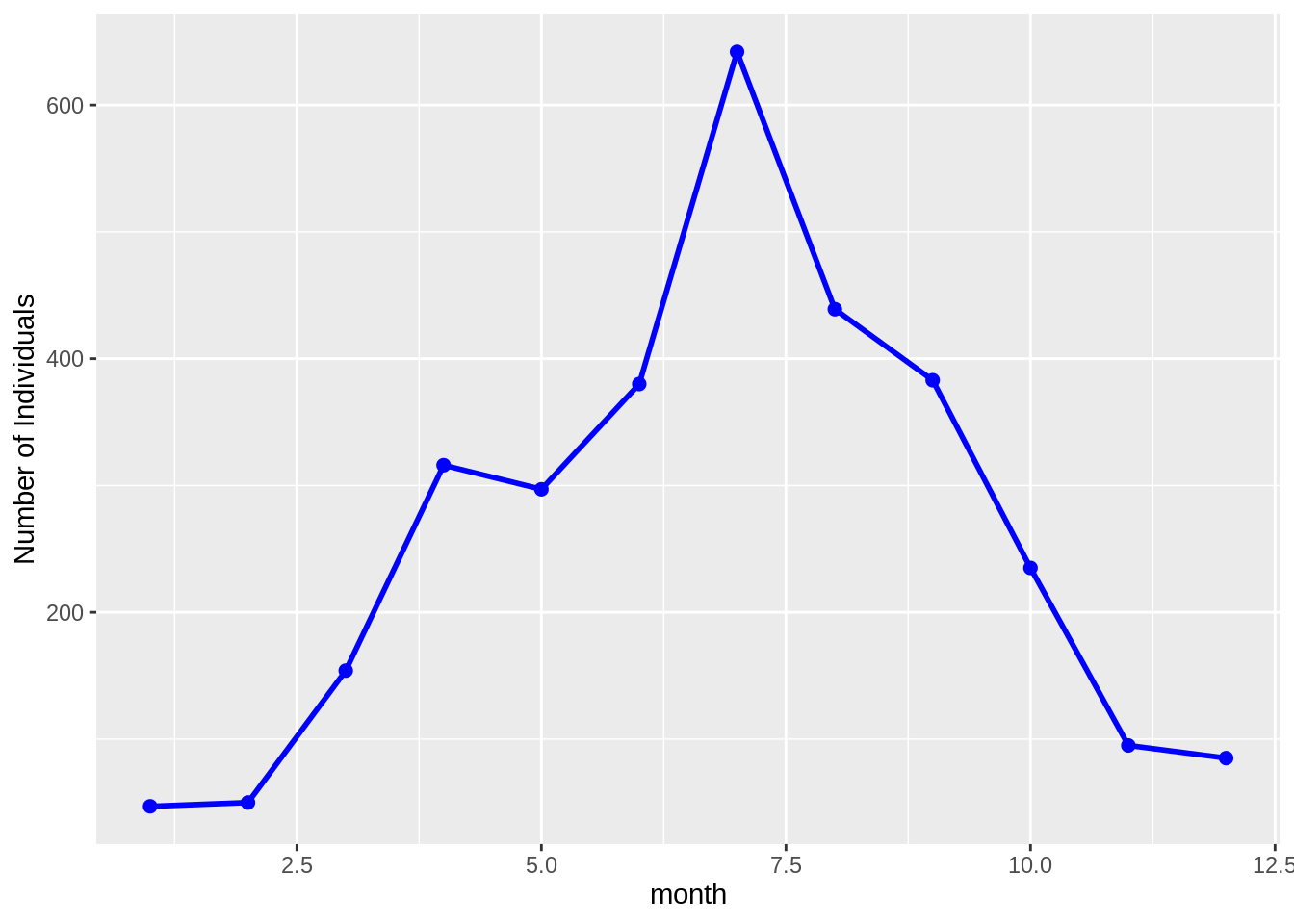
- Use your function, and the data in
surveys.csv and species.csv, to plot the time-series for time = month, genus_name = "Chaetodipus" and species_name = "penicillatus" (this plot will show the average seasonal pattern of Chaetodipus penicillatus abundances)
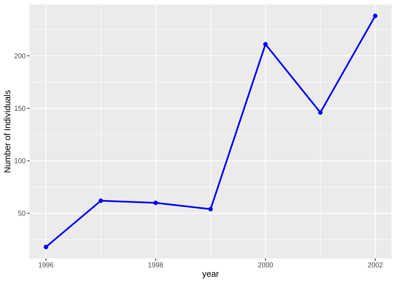
- Use your function, and the data from
plots.csv, surveys.csv and species.csv, and dplyr to plot the time-series for time = year, genus_name = "Chaetodipus" and species_name = "baileyi" only on the "Control" plots.