Longer lived organisms typically invest more in their offspring. We want to explore the form of this relationship by looking at the relationship between lifespan and gestation period in mammals.
Check to see if Mammal_lifehistories_v2.txt is in your working directory. If not download it from the web. This is tab delimited data, so you’ll want to use read_tsv().
Missing data in this file is specified by -999 and -999.00. Tell R that these are null values using the optional read_tsv() argument, na = c("-999", "-999.00"). This will stop them from being plotted.
Some of the column names have parentheses in them. E.g., mass(g). To work with column names like this we enclose them in back ticks. E.g., `mass(g)` Back ticks are typically on the same key as the ~ and look like a slanted single quotation mark.
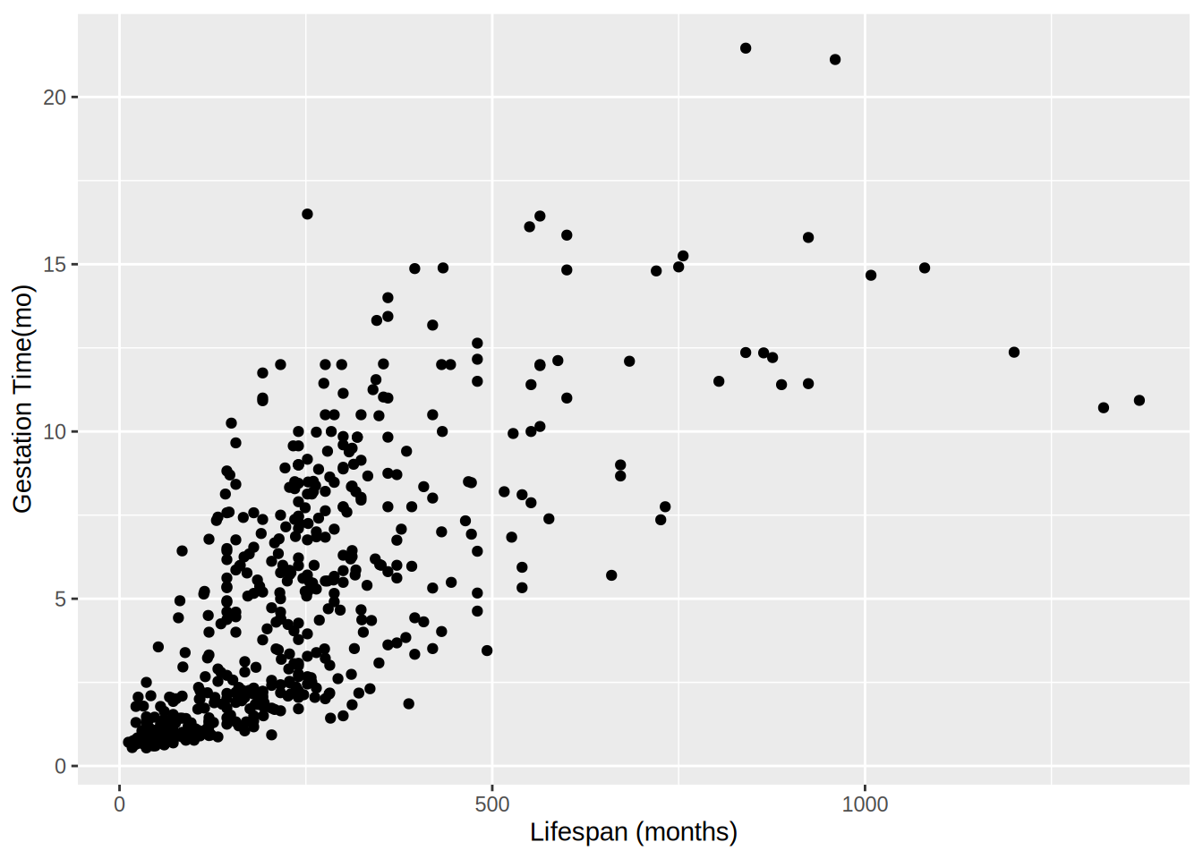
- Graph lifespan (
max. life(mo)) vs. gestation period(gestation(mo)). Label the axes with clearer labels than the column names.
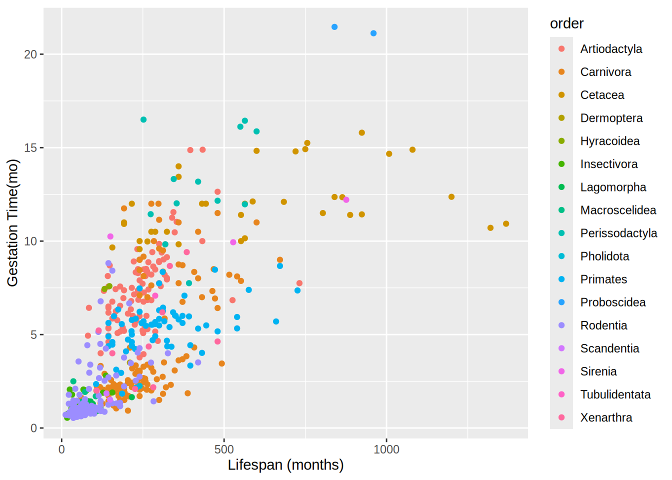
- This looks like a pretty regular pattern, so you wonder if it varies among different groups. Graph lifespan vs. gestation periodwith the data points colored by order. Label the axes.
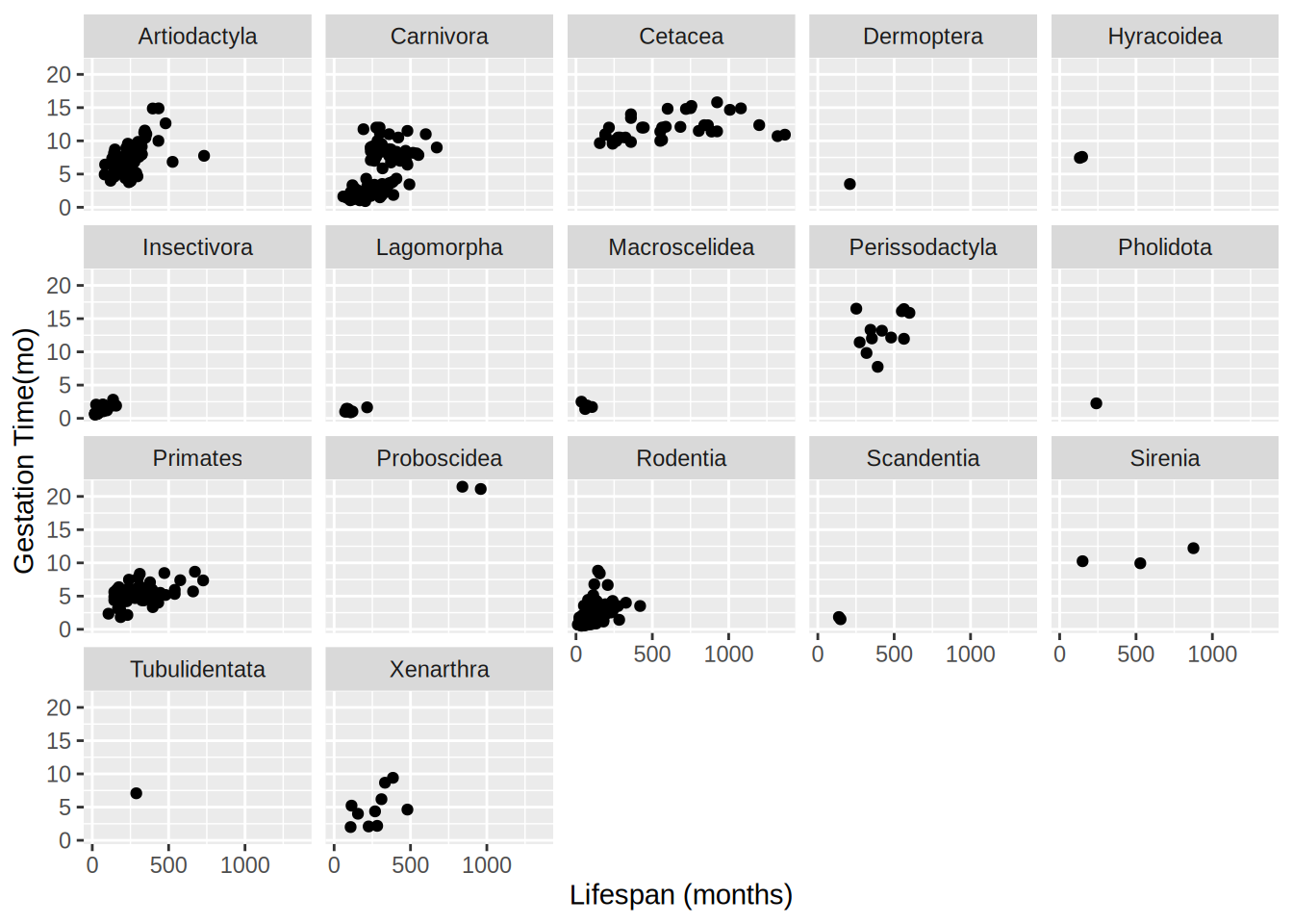
- Coloring the points was useful, but there are a lot of points and it’s kind of hard to see what’s going on with all of the orders. Use
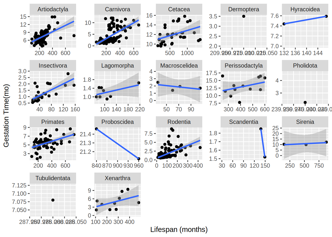
facet_wrap to create a subplot for each order.
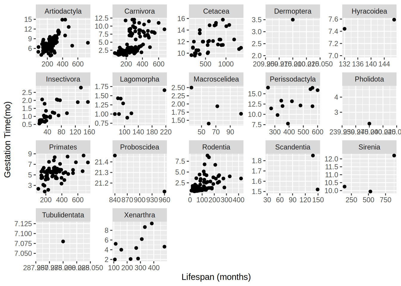
- Since different orders have different average sizes it can be hard to see the relationship for some orders. Let the axes vary across different facets by setting the options
scales argument to "free"
- Now let’s visualize the relationships between the variables using a simple linear model. Create a new graph like your faceted plot, but using
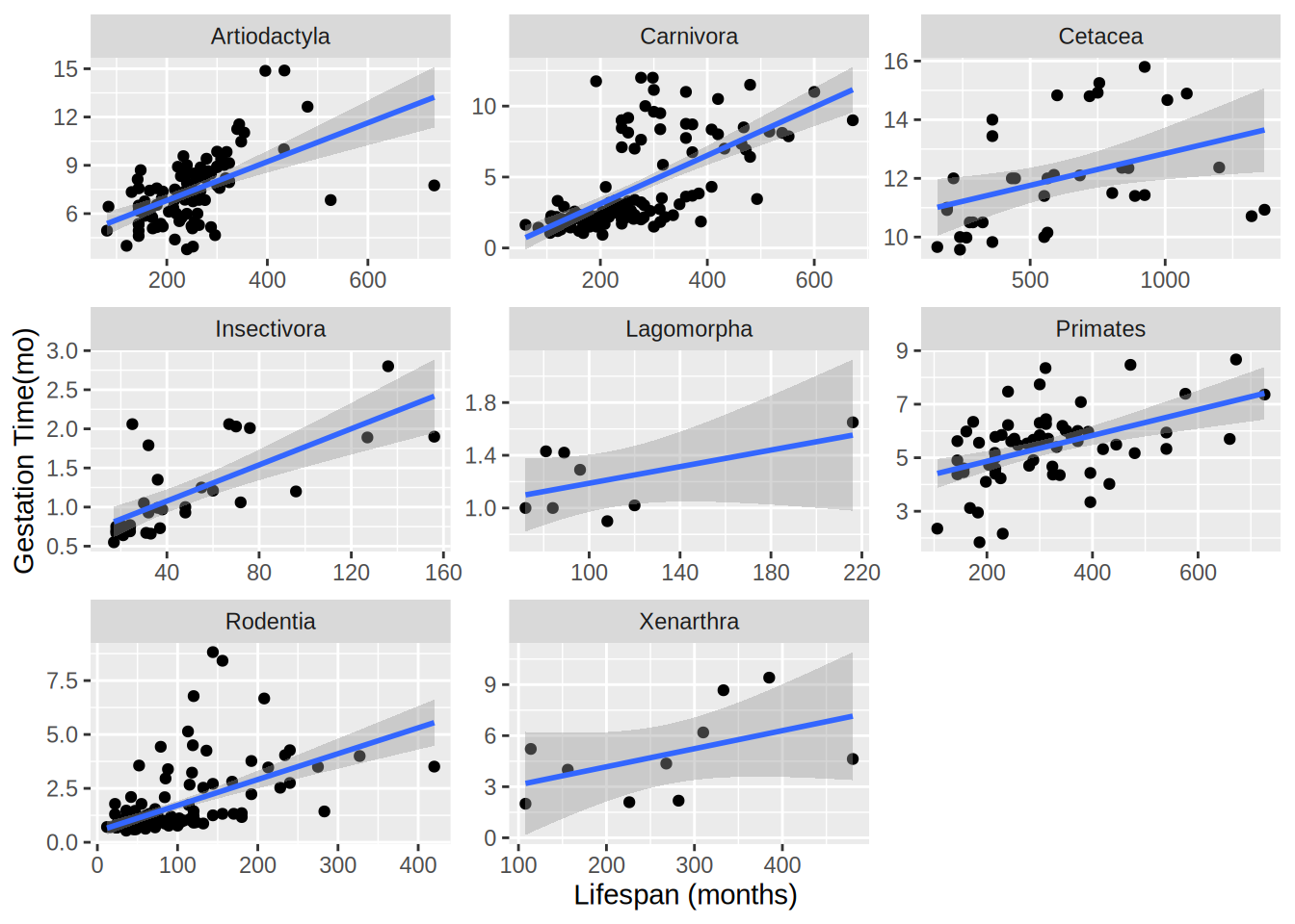
geom_smooth to fit a linear model to each order. You can do this using the optional argument method = "lm" in geom_smooth.
- Make a bar plot showing the number of species (rows) in each
order. Label the x axis “Order” and the y axis “Number of Species”.
- Use
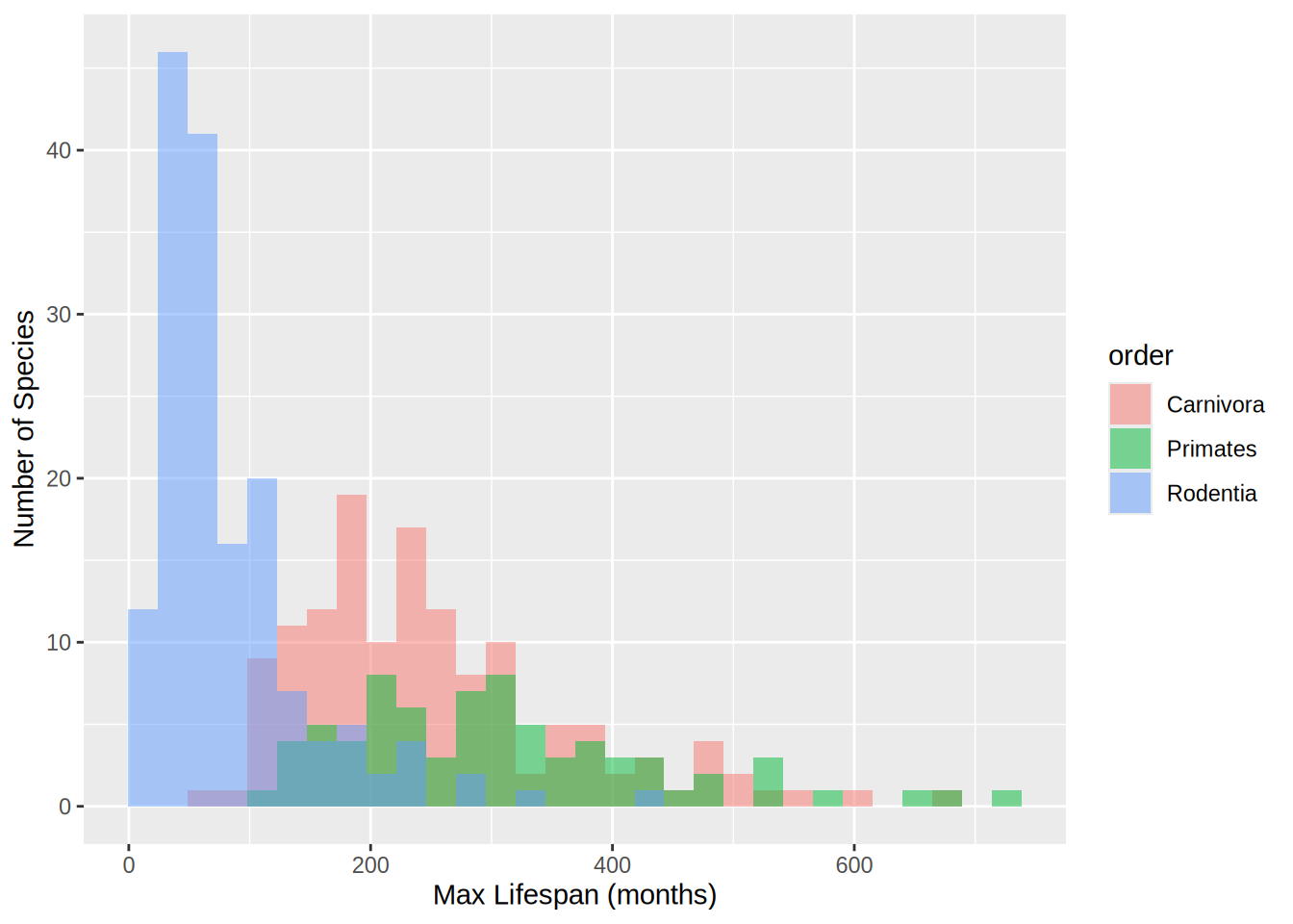
filter() to keep only the orders "Carnivora", "Primates", and "Rodentia" (these have enough data points to compare). Then make a non-stacked histogram of lifespan (`max. life(mo)`) colored by order. Set alpha to 0.5 so that you can see all three histograms. Label the x axis “Max Lifespan (months)” and the y axis “Number of Species”.
- Challenge (optional): Some of the orders don’t have enough data points to fit a meaningful linear model. Instead of manually picking the orders to plot, use
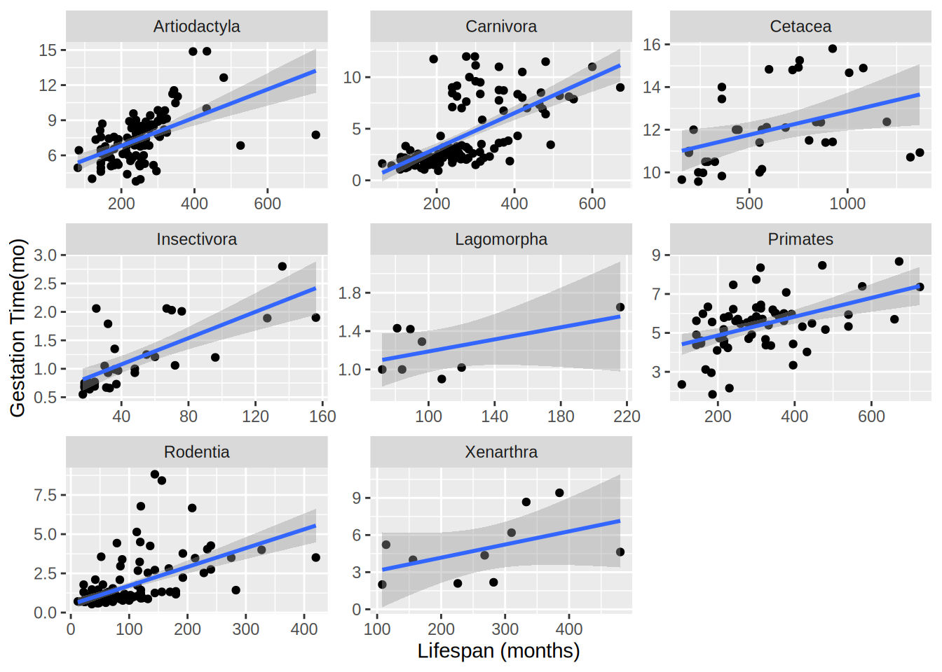
group_by and summarize and your data frame to create a new data frame with counts of the number of species (i.e., rows) in each order. Join this data frame (using inner_join) to your main data frame and use the new species counts to filter the data frame to only keep orders with at least 20 species. Then remake the graph from (5) with this filtered data. Note that there won’t be 20 points for all orders because some orders are missing values for some columns.