Graphing mass vs metabolism (solution)
NoteExercise
The relationship between the body size of an organism and its metabolic rate is one of the most well studied and still most controversial areas of organismal physiology. We want to graph this relationship in the Artiodactyla using a subset of data from a large compilation of body size data (Savage et al. 2004). You can copy and paste this data frame into your program:
size_mr_data <- data.frame(
  body_mass = c(32000, 37800, 347000, 4200, 196500, 100000,
    4290, 32000, 65000, 69125, 9600, 133300, 150000, 407000,
    115000, 67000,325000, 21500, 58588, 65320, 85000, 135000,
    20500, 1613, 1618),
  metabolic_rate = c(49.984, 51.981, 306.770, 10.075, 230.073,
    148.949, 11.966, 46.414, 123.287, 106.663, 20.619, 180.150,
    200.830, 224.779, 148.940, 112.430, 286.847, 46.347,
    142.863, 106.670, 119.660, 104.150, 33.165, 4.900, 4.865),
  family = c("Antilocapridae", "Antilocapridae", "Bovidae",
    "Bovidae", "Bovidae", "Bovidae", "Bovidae", "Bovidae",
    "Bovidae", "Bovidae", "Bovidae", "Bovidae", "Bovidae",
    "Camelidae", "Camelidae", "Canidae", "Cervidae",
    "Cervidae", "Cervidae", "Cervidae", "Cervidae", "Suidae",
    "Tayassuidae", "Tragulidae", "Tragulidae"))
Make the following plots with appropriate axis labels:
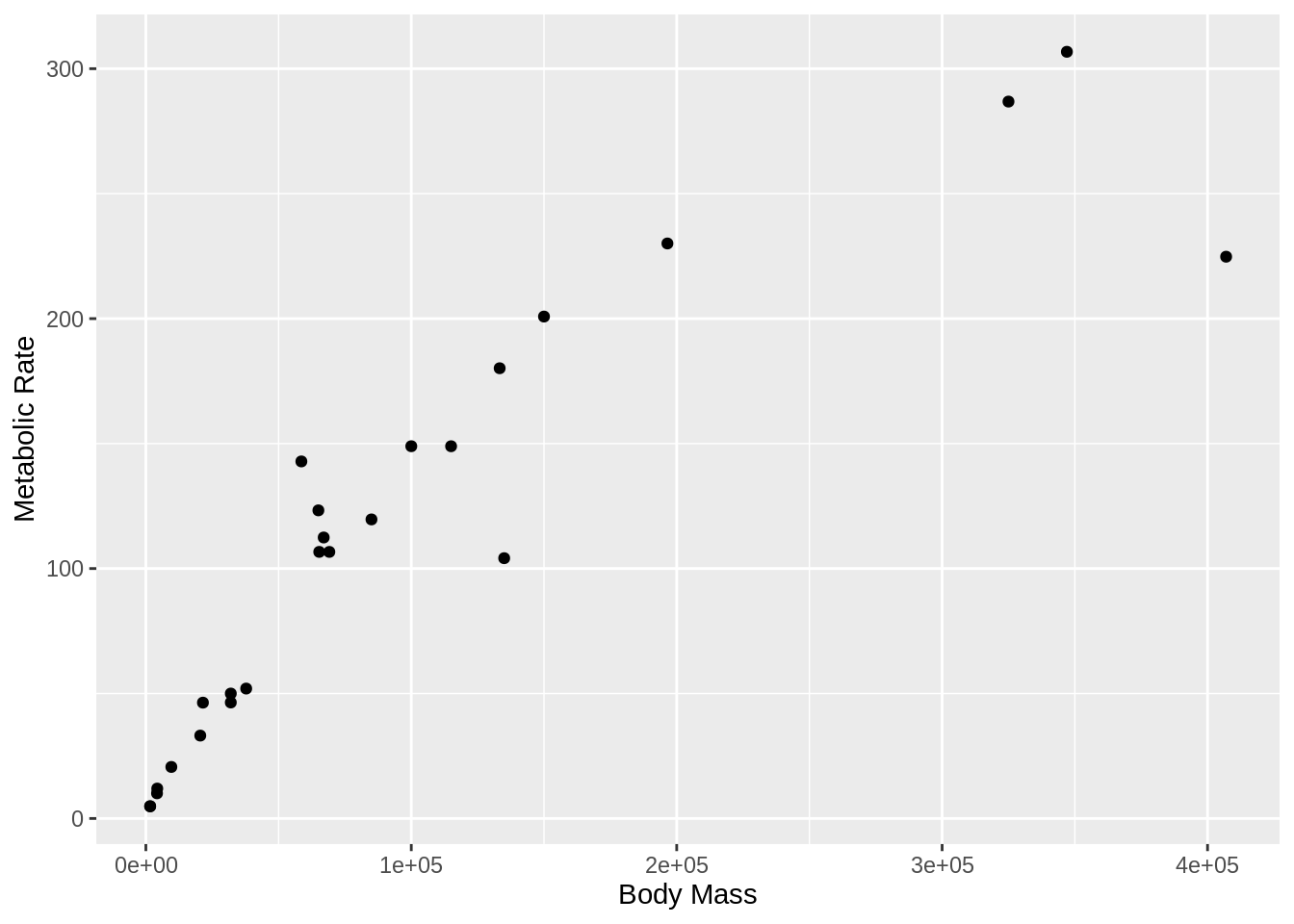
- A plot of body mass vs. metabolic rate
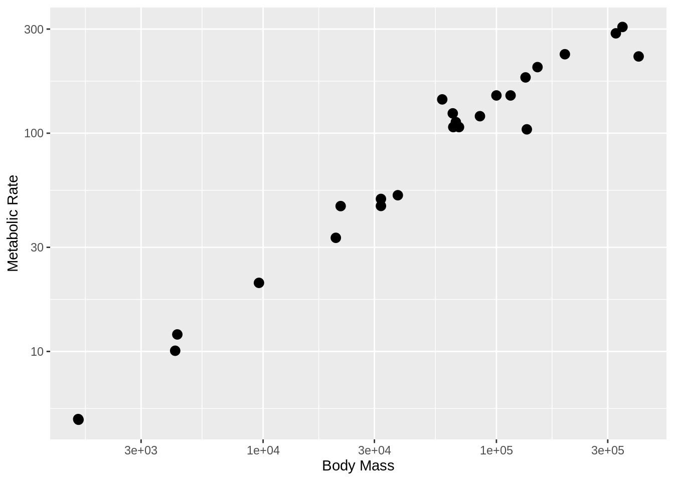
- The same plot as (1) but with the point size set to 3.
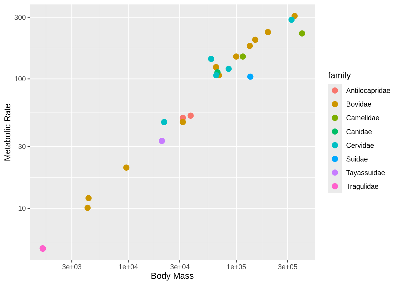
- The same plot as (2), but with the different families indicated using color.
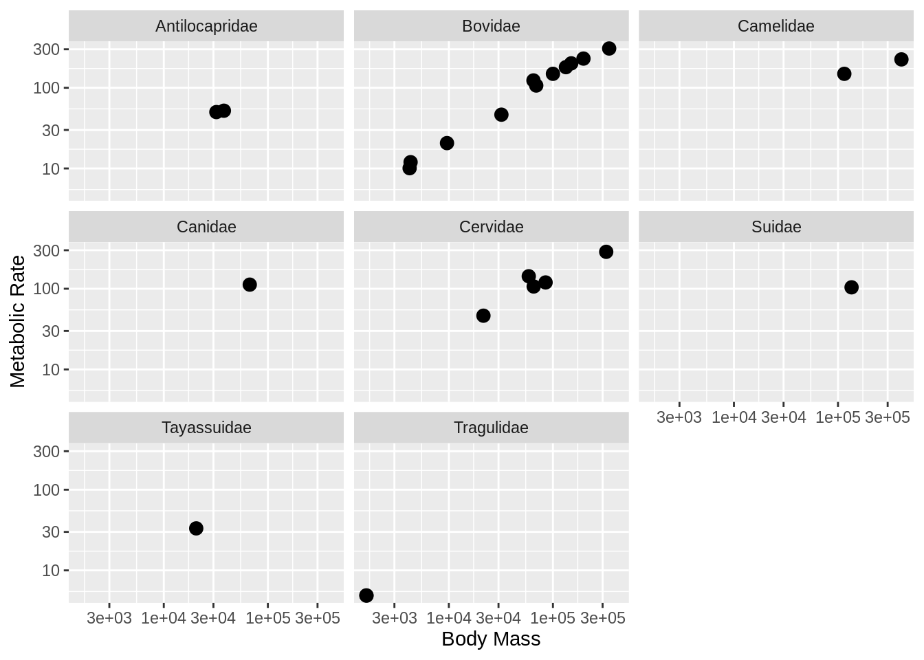
- The same plot as (2), but with the different families each in their own subplot.
CautionOutput solution
- A graph of body mass vs. metabolic rate
- A graph of body mass vs. metabolic rate, log scaled, with pt size 5.

- The same plot as (2), but with the different families indicated using color.

- The same plot as (2), but with the different families each in their own subplot.
